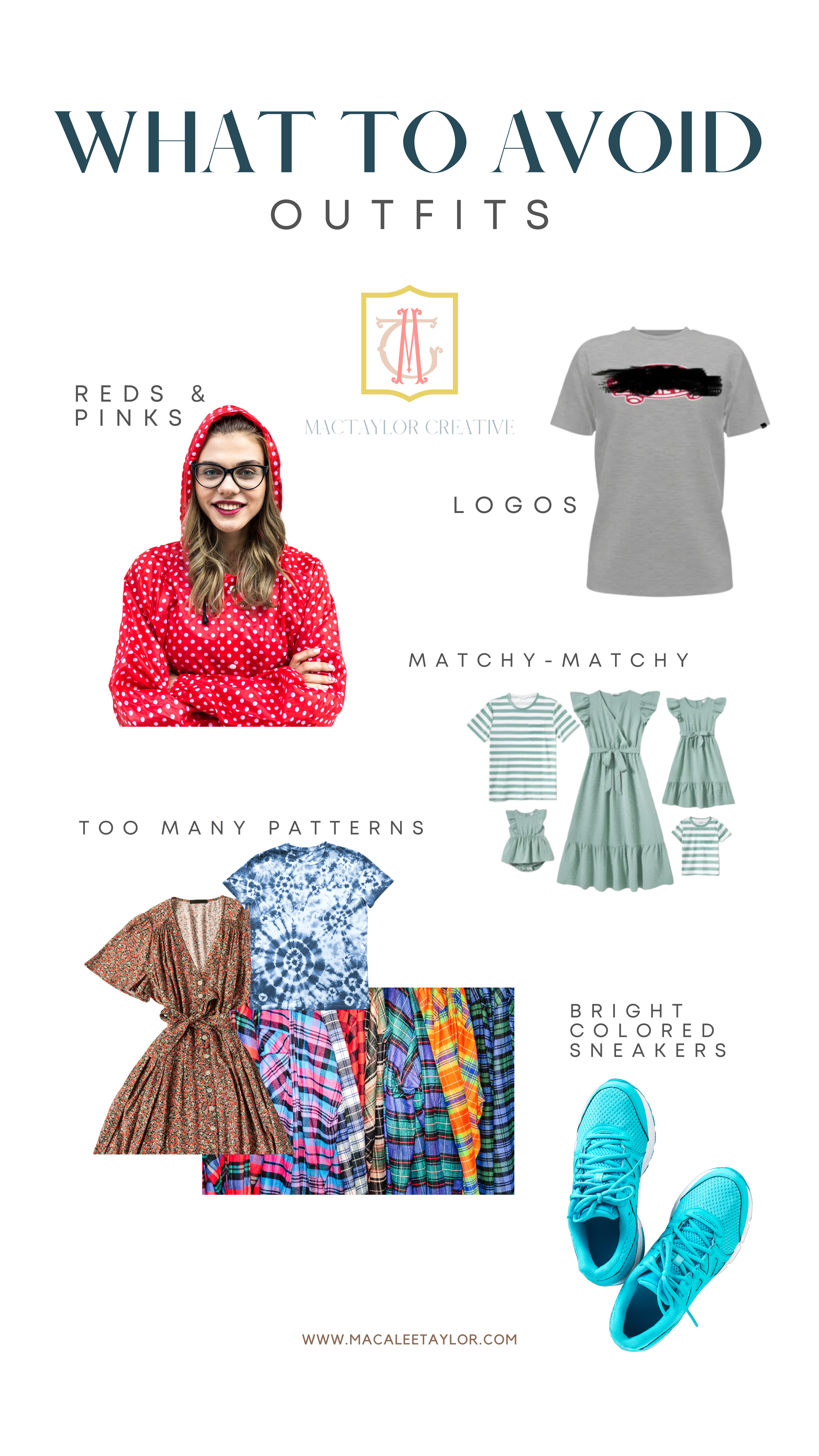
Logos
You will draw attention away from what is genuinely essential in the photos!!
People will be looking at your shirt instead of your faces. Also, I
don’t want to remove a brand from every single photo of you… thank you!
Patterns
Too many patterns mixed together are distracting and difficult to look at.
I genuinely appreciate the richness that patterns may provide.
It’s fantastic to select a couple to blend!
But please don’t go for plaid, stripes, polka dots, or floral!
Vibrant Reds & Pinks
Do you have any ideas why you should avoid reds and pinks?
They reflect on your skin and alter your skin tone.
This can make altering and matching skin tones quite difficult!
Bright Sneakers
I want you to be yourself and feel at ease, but please refrain from wearing your bright sneakers specifically for your photo shoot. They are once again extremely distracting.
Matchy-Matchy
Finally, being too matchy-matchy is simply… wrong, I know – there was a time we ALL did that 10-20 years ago… but we learn from history, right? You’ll all blend in, your outfits won’t stand out, and your session may wind up looking like some awkward family photos, or that you belong on a team of some kind. If you need assistance selecting outfits for your photos, please contact me before purchasing matching outfits!!
I’d be delighted to work with you! To learn more about scheduling a session, please contact me. I guarantee we’ll have a good time! Follow along on Instagram to see more!